Where Should You Include The Pantone Color Of The Year

Where Should You Include The Pantone Color Of The Year

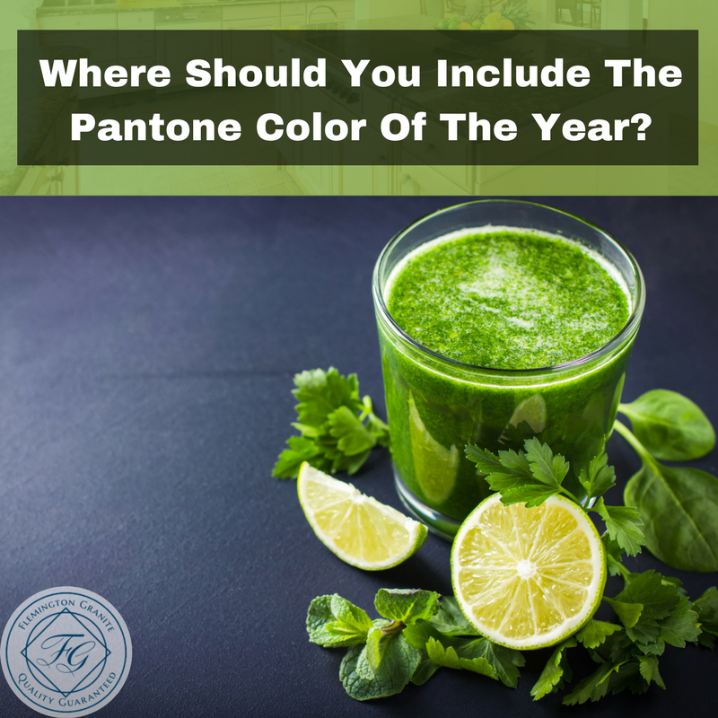
Just like any other aspect of decorating, colors also follow trends. Pantone, the leading experts in color, recently released their “Color of the Year,” based on choices that are popular and also represent current events. So what is the color of the year 2017? This year’s color is “Greenery,” a color that is reminiscent of the greens of spring. It also symbolizes vitality and a return to nature.

Why Greenery?

Pantone says that they chose the greenery color because it is refreshing and revitalizing, a bright, cheerful yellow-green that symbolizes new beginnings, much like spring. The color blends well with bright colors but also works perfectly with black and white color patterns.

On the table, #Greenery pops with freshness. 💚🥑🍃🥒🍏💚 📷: @lucialitman

A post shared by PANTONE (@pantone) on

Green Wall Paint

The soothing color of Greenery is perfect for painting, whether you choose it for an entire room or just an accent wall. Accent walls are an excellent way to test the color before you commit to the entire room. The spring green will help improve mood and create a sense of relaxation. It brings thoughts of nature so you feel more refreshed.

#Greenery pops with pink. 🍃🌸 #ColoroftheYear2017. 📷: @xuzzi

A post shared by PANTONE (@pantone) on

Bathroom Tiles

Greenery-colored tiles are a perfect choice for a backsplash in your bathroom. The green will give your bathroom a clean fresh appearance. You can also create an accent wall behind your bathroom sink and add a glass-tile backsplash to offset the green. You can also add decorative hand towels in greenery for a slight splash of color in the bath.

Use Pantone Color Of The Year Accent Pieces

If you aren’t sure if greenery is the right color for you, start with small accent pieces. Throw pillows on a sofa or lamp bases in spring green. If you want to go bolder, consider painting your kitchen cabinets this shade of green or invest in greenery-toned appliances. Vases, chair cushions and decorative bowls are another way to bring greenery into your décor easily.

A post shared by PANTONE (@pantone) on

The goal is to bring your décor back to nature which is why Pantone selected greenery as the Color of the Year. The color works whether your style is neutral or bold as it works well with bright colors or those that are muted. If you are considering using greenery in your décor and want to learn the best way to use it in your project, contact our knowledgeable staff today. They can help you select everything from accent pieces to countertops and flooring that will work perfectly with the Pantone Color of the Year. You can reach us by completing the easy form online or giving us a call today.

How To Embrace Feng Shui In Your Kitchen

How To Embrace Feng Shui In Your Kitchen

The Chinese philosophy of Feng Shui can be applied to home decor to create a sense of harmony. Arranging furniture to improve the energy in a room is believed to translate to a positive mind and body. Implement our tips to improve crucial elements of your kitchen so that it is more warm and inviting.

Minimize Clutter

Unnecessary objects taking up space are unsightly to begin with, but they also block the free flow of energy. It’s relaxing to see organization, open shelving units, and a room that is completely free from the usual clutter. Go through the room and make sure that anything used infrequently is stored out of plain sight.

Add More Light

Overhead light gets the job done as far as creating adequate visibility to prepare meals and clean. Increase the brightness with the natural light of windows, mirrors that reflect other light sources, and a few smaller fixtures. If you have the room, consider installing a skylight to take advantage of the natural resources on sunny days.


Incorporate Each of the Elements

Proper Feng Shui in the kitchen is established with a healthy balance of wood, metal, water, fire, and earth elements. If only one or two of these elements are able to overpower the others, it can become destructive to the positive energy. You can represent each element in the natural form or implement colors throughout the room to create a healthy balance.

Create Energy With Mirrors

Create Energy With Mirrors

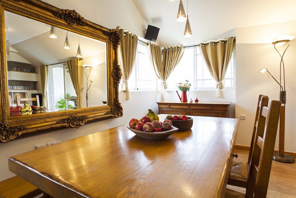
If you have a smaller kitchen, there are ways to decorate so that it seems more spacious. A few well-placed mirrors grab and project the light coming from nearby fixtures and windows. You should notice an overall increase in the energy of the room when it is no longer lost in the walls.

Bring Nature Inside

Living things, like fresh plants, boost the energy in the kitchen by representing the earth element. It’s easy to overlook the benefits of fresh flowers or fruit with the ease of plastic placeholders, but nothing compares to authenticity.

Balance Colors

Every color serves a different purpose in the kitchen design based on their unique meaning. If you want the kitchen to give off a feeling of cleanliness and purity, white is always a safe color option that pairs well with others. Blues are believed to curb hunger and bring out a calm feeling if used in moderation. You may prefer the benefits of yellow tones that promote socialization, happiness, and positivity.

Put Thought Into Your Choice of Plates

The dishes that you eat from should feature a color that serves a purpose. Circular plates are believed to promote the flow of energy more freely than the square options. If you are trying to control or decrease your weight, blue is the best color choice. Boost appetite by serving on dishes that primarily feature orange, yellow, or red.