You don’t have to be an interior designer to appreciate exceptional color schemes in the home. With so much confusing industry-specific lingo, it can get confusing when you’re trying to coordinate colors.
We’re going to lay out the basics that you need to know so that you have total confidence in any color choices that you make.
How To Use the Color Wheel
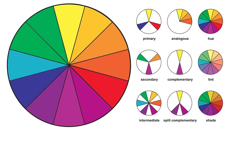
The color wheel is an easy visual representation that most of us learned about in early childhood. Primary colors are represented an equal distance apart with a total of 12 categorized shades and tints filling in the empty spaces.
Rather than try to memorize the entire color matching chart, it can be accessed on any mobile device the you the next time you’re out paint shopping.
What Are the Basic Colors
It takes at least 12 shades to create a complete color wheel, but some are even larger. Most interior design pallets begin with a single selection from this color matching system. These colors are on the very basic wheel:
- Primary colors (blue, red, yellow) stand on their own and cannot be created from a mixture of any other colors.
- Secondary colors (green, orange, purple) are created when a combination of the primary colors are combined.
- Tertiary colors are the shades created from a mixture of different primary and secondary colors
Changing Colors With Neutrals
After the first color is decided, lighter and darker variations (tint, shade, tone) can be created by using a neutral color.
- Tint is the color that develops after the white is added.
- Shade is the color that results from adding black.
- Tone is a slightly darker version created by adding gray.
Understanding Color Temperature
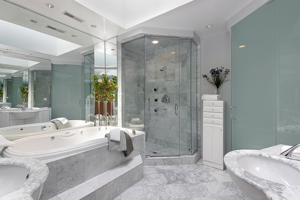
The spot where the color falls on the wheel can help you identify the temperature. Warm, vibrant colors (orange, red, yellow) make a room feel lively and intimate. Cool, calm colors (blue, green, purple) create a relaxed feeling in a room.
It’s a smart idea to consider the feel that you want in the room to choose the correct temperature.
Complementary Color Scheme
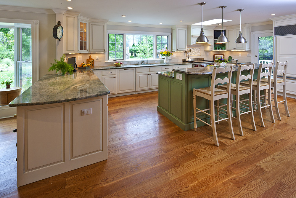
Any two colors that are positioned opposite of one another on the wheel are complimentary. The color scheme typically has one color working as the dominant shade while the other is only used as an accent.
Keep in mind that the colors are going to have a high contrast and need to be accompanied by neutrals as well.
Split-Complementary Color Scheme
A safer choice for designers that don’t want to add bold colors into their home could choose a split-complementary scheme. Instead of working with the color across from your base shade, you can choose a color two shades to the side of the opposite.
It’s going to provide more opportunity to use the muted shade instead of additional neutrals.
Analogous Color Scheme
Using the 60-30-10 rule, the analogous scheme is created by using three consecutive colors on the wheel. The dominant shade will be used the most, with the middle shade coming in as support.
The remaining color is only used as a vibrant accent to make certain areas pop.
Triadic Color Scheme
Three different colors spaced equally on the wheel, such as the primary colors, create a triad. It’s not an arrangement that is recommended for all rooms because it is typically high contrast and lively.
The triadic color scheme is great for a playroom or children’s bedroom as long as the nearby rooms are neutral.
Tetradic Color Scheme
Using a rectangular configuration, the tetradic scheme incorporates a total of four colors. You should have two pairs of complimentary colors, with a balance of two warm and two cool.
It’s easy to go overboard with saturation if you do not use the colors equally to create a natural balance.
Square Color Scheme
The only real difference between the square and rectangle scheme is that the colors are evenly spaced on the wheel. There should be a total of two tertiary colors, one secondary, and one primary to complete the square.
Pick a dominant shade, but make sure that you have an equal number of warm and cool colors.

